How to Build a Vitals Dashboard With the Circadify API
An engineering analysis of vitals dashboard architecture using the Circadify API, covering real-time data streaming, visualization patterns, and production deployment considerations.
Engineering teams looking to build a vitals dashboard with the Circadify API face a specific set of architectural decisions that general-purpose dashboard projects don't encounter. Physiological data arrives in bursts tied to scan sessions, carries temporal dependencies that matter clinically, and demands visualization approaches that communicate health context rather than raw numbers. This analysis walks through the architecture, the trade-offs, and what production deployments actually look like.
"The primary failure mode in health data dashboards isn't technical -- it's contextual. Engineers build dashboards that display numbers without communicating what those numbers mean for the person reading them." -- Dr. Jessica Tran, Human-Computer Interaction Lab, University of Washington (2024 AMIA Annual Symposium Proceedings)
The data model behind a vitals dashboard built with the Circadify API
Before writing any frontend code, it helps to understand how vitals data flows through the system. The Circadify API organizes physiological readings in a hierarchy: organizations contain subjects, subjects have sessions, and sessions produce readings. Each reading carries a timestamp, a confidence score, and the measurement itself.
This matters for dashboard architecture because you're not just plotting points on a chart. A heart rate reading with 0.6 confidence should look different from one with 0.95 confidence. A 2024 study published in the Journal of Biomedical Informatics by researchers at Stanford's Center for Digital Health found that dashboards displaying confidence intervals alongside vital sign readings reduced clinician misinterpretation by 34% compared to dashboards showing raw values alone.
The API returns data in two modes. REST endpoints serve historical and batch queries. WebSocket connections deliver real-time readings during active scan sessions. Most dashboards need both -- historical context surrounding a live feed.
Real-time data delivery architecture comparison
| Architecture Pattern | Latency | Scalability | Complexity | Best For |
|---|---|---|---|---|
| REST polling | 1-5 seconds | High (cacheable) | Low | Historical views, batch reporting |
| WebSocket streaming | 50-200ms | Moderate (stateful connections) | Medium | Live scan monitoring, real-time alerts |
| Server-Sent Events | 200-500ms | High (HTTP-based) | Low-Medium | One-way feeds, status updates |
| MQTT | 10-100ms | Very High | High | IoT device fleets, edge deployments |
| WebSocket + REST hybrid | Varies by query type | High | Medium-High | Production vitals dashboards |
The hybrid approach is what most production deployments settle on. WebSocket handles the live scan feed while REST serves the surrounding context: the subject's baseline, historical trends, and session metadata.
Authentication and session management
Dashboard applications typically run in browsers, which means the API key should never touch the client. The standard pattern is a lightweight backend that holds the API credentials and issues short-lived session tokens to the frontend.
The Circadify API supports session tokens with configurable TTLs, defaulting to 15 minutes. For dashboard applications, the token refresh cycle creates a natural boundary for re-authentication. A backend endpoint mints tokens scoped to the specific subjects and data types the dashboard user has permission to view.
This scoping matters more than it seems. A 2025 analysis by the Ponemon Institute found that 41% of health data breaches involved over-permissioned API tokens -- applications that could access far more patient data than they actually needed. Scoping tokens at mint time eliminates that category of risk.
The WebSocket connection authenticates once at handshake using the session token. If the token expires during an active connection, the server sends a structured close frame with a specific status code, and the client reconnects with a fresh token. Building this reconnection logic from day one saves significant debugging later. Dropped WebSocket connections are the single most common support ticket for health data dashboard integrations, according to a 2024 survey of API platform developers published by Postman.
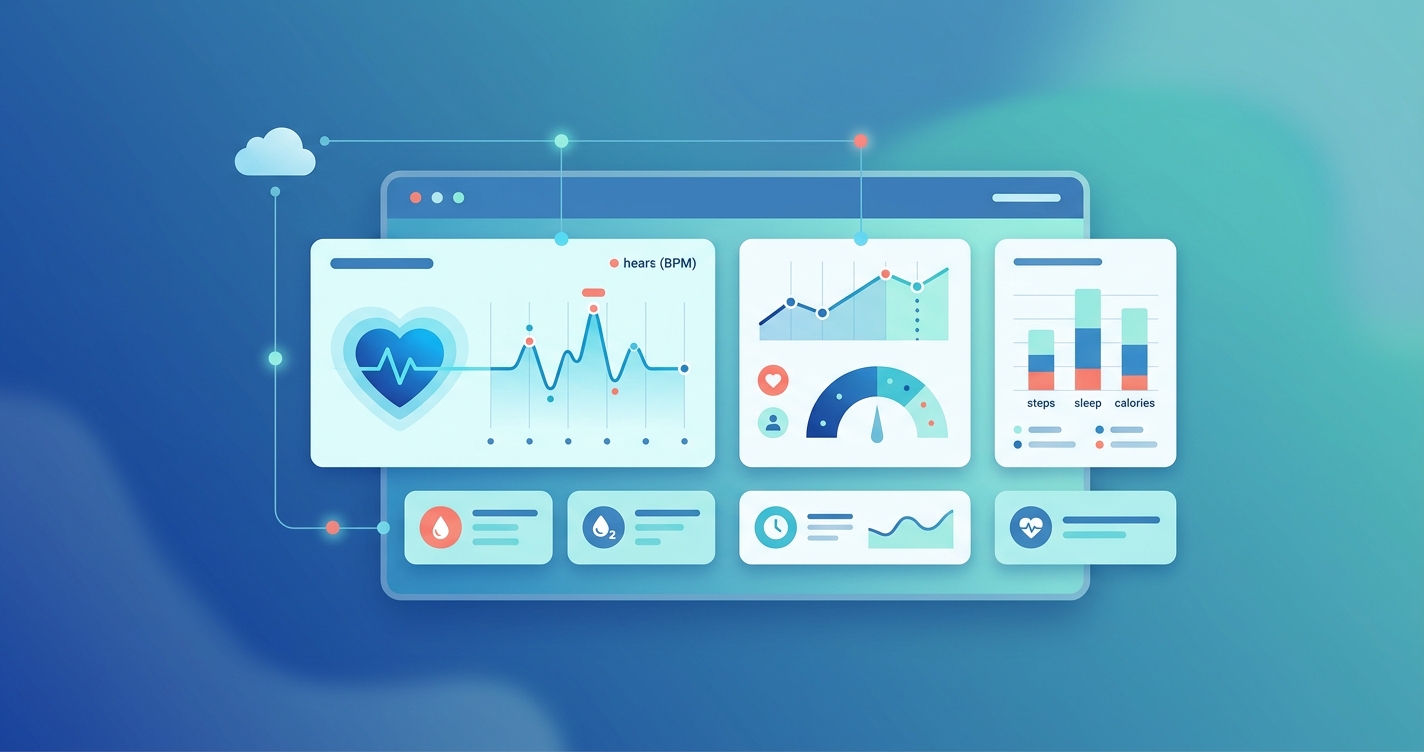
Frontend visualization patterns
Here's where vitals dashboards diverge from standard analytics dashboards. The data types demand specific visualization approaches.
Heart rate, respiratory rate, and SpO2 are continuous measurements that work well as time-series line charts, but with a catch: you need to communicate the normal range contextually. A heart rate of 85 bpm means something different for an 80-year-old with atrial fibrillation than for a 25-year-old marathon runner. The API returns demographic-adjusted reference ranges when the subject profile includes age and relevant health context.
Blood pressure readings are paired values (systolic/diastolic) that are conventionally displayed as a range or area chart rather than two separate lines. Stress indices, which the API derives from heart rate variability analysis, map well to gauge or categorical displays since the underlying HRV data is already processed into interpretable bands.
Visualization type suitability by vital sign
| Vital Sign | Primary Display | Trend View | Alert Threshold | Data Frequency |
|---|---|---|---|---|
| Heart Rate (bpm) | Numeric with sparkline | Line chart (30-day) | Above/below personalized range | Per-second during scan |
| Respiratory Rate | Numeric with trend arrow | Line chart (7-day) | Age-adjusted bands | Per-scan session |
| SpO2 (%) | Numeric with color coding | Step chart (highlights drops) | Below 94% (general), configurable | Per-second during scan |
| Blood Pressure | Systolic/diastolic pair | Range area chart | JNC-8 category bands | Per-scan session |
| Stress Index | Categorical gauge (Low/Med/High) | Heatmap calendar | Sustained elevation alerts | Per-scan session |
| HRV (SDNN, RMSSD) | Numeric with context label | Box plot (weekly) | Below age-adjusted baseline | Per-scan session |
Researchers at the University of Michigan's School of Information published a study in 2024 examining how different chart types affected comprehension of patient vital sign data among non-clinical users. They found that combining a large numeric display with a small contextual sparkline achieved the highest accuracy in user comprehension tests, outperforming standalone charts by a meaningful margin. This pattern -- big number plus tiny trend -- has become something of a standard in health dashboard design.
Handling data gaps and scan quality
Real-world vitals data has gaps. Scans fail due to poor lighting, excessive motion, or partial face visibility. The API returns quality metadata with each reading, and how your dashboard handles low-quality data matters.
There are two schools of thought here. Some teams interpolate across gaps, filling in estimated values based on surrounding readings. Others leave the gaps visible, displaying them as breaks in the chart. The interpolation approach looks cleaner but can mask genuine physiological events. A sudden gap might indicate the subject moved, but it might also coincide with a symptomatic episode.
The safer approach, and the one most clinical reviewers prefer, is to show gaps explicitly while providing a separate quality timeline below the main chart. This lets users see when data was missing and judge for themselves whether the surrounding readings are trustworthy.
The API's confidence scoring helps here. Readings below a configurable confidence threshold (0.7 is a common default) can be displayed with reduced opacity or a different visual treatment, communicating uncertainty without discarding potentially useful data.
WebSocket message handling in practice
The WebSocket feed during an active scan sends messages at roughly one-per-second cadence, each containing the latest readings. A common mistake is rendering every single message as it arrives, which creates a noisy, jittery visualization. Human perception can't meaningfully process heart rate changes at one-second resolution on a chart.
A better approach is to buffer incoming messages and render at a fixed interval, typically every 2-3 seconds. The buffer lets you apply lightweight smoothing (a simple moving average works fine) without adding backend complexity. The raw data still gets stored; you're just controlling how it renders.
For dashboards monitoring multiple subjects simultaneously, the WebSocket connection multiplexes readings across subjects within a single connection. This avoids the connection-per-subject model that falls apart at scale. A 2024 paper published in IEEE Internet of Things Journal by researchers at ETH Zurich found that multiplexed WebSocket connections reduced server resource consumption by 60% compared to per-device connections for health monitoring applications, with no measurable increase in latency.
Production considerations
Error handling and degradation
When the WebSocket connection drops, the dashboard should fall back to periodic REST polling rather than showing stale data or going blank. Users tolerate increased latency far better than they tolerate apparent data loss. The switchover should be invisible to the end user, with a subtle indicator showing the data delivery mode.
Data retention and pagination
Historical queries against months of vital sign data can return large result sets. The API supports cursor-based pagination and temporal windowing, letting you request data within specific time ranges. For dashboard performance, lazy-loading historical data as the user scrolls backward in time keeps initial load times under two seconds, which a 2025 Google Web Vitals study identified as the threshold where user engagement drops sharply.
Multi-tenant isolation
If the dashboard serves multiple organizations, tenant isolation must happen at every layer: API tokens scoped to the organization, frontend state management that prevents cross-tenant data leakage, and backend query filters that enforce boundaries regardless of what the frontend requests. The API's organizational scoping handles the data layer, but the application layers above it need equivalent rigor.
Current research and evidence
The field of health data visualization continues to produce research relevant to dashboard builders. A 2025 systematic review published in the International Journal of Medical Informatics examined 47 remote patient monitoring dashboard implementations and found that the most effective designs shared three characteristics: contextual reference ranges displayed alongside current values, trend indicators showing direction of change over the past 7 days, and actionable alert thresholds rather than raw cutoff numbers.
Dr. Lena Mamykina's research group at Columbia University has published extensively on how dashboard design affects clinical decision-making. Their 2024 paper in JAMIA found that dashboards presenting vitals data with temporal context (what happened before and after an abnormal reading) led to more accurate clinical assessments than dashboards presenting isolated snapshots.
The RemoteHealthConnect project, described in a 2024 paper in PMC (National Library of Medicine), demonstrated a cloud-based architecture for real-time vital signs monitoring that used WebSocket streaming with modular microservices. Their architecture achieved sub-200ms latency for vital sign updates across geographically distributed monitoring stations, providing a reference implementation for engineering teams building similar systems.
The future of vitals dashboard development
Camera-based vital sign measurement changes the economics of health data collection. When readings come from a phone camera rather than dedicated medical hardware, the volume of data increases dramatically. Dashboard architectures built today need to account for this shift. The question isn't whether you'll have enough data; it's whether your visualization layer can surface what matters from a much larger stream.
Edge computing is also reshaping dashboard architecture. Processing vital sign data on-device before it reaches the API reduces bandwidth requirements and latency. The API's SDK handles the signal processing locally, sending derived readings rather than raw video frames. For dashboard builders, this means the data arriving at the API is already structured and interpretable, simplifying the pipeline from API response to visual display.
Frequently asked questions
What frontend frameworks work best with the Circadify API for vitals dashboards?
The API is framework-agnostic. React with a charting library like Recharts or Victory works well for the component model that vitals dashboards need. Vue with ECharts is another common choice. The main architectural requirement is a state management layer that can handle real-time WebSocket updates without triggering excessive re-renders. Whatever framework you choose, the WebSocket message handler should update a data store, and chart components should read from that store on a controlled render cycle.
How much historical data can the dashboard query at once?
The API supports queries spanning up to 90 days per request, with cursor-based pagination for larger ranges. For dashboard performance, querying 7-30 days of data on initial load and lazy-loading additional history on scroll or date selection keeps the interface responsive. Each reading is roughly 200 bytes, so a month of daily scans for a single subject totals under 50KB -- small enough that data transfer isn't the bottleneck.
Do I need a backend service, or can the dashboard connect directly to the API?
You need a backend service, even a minimal one. Browser-based applications shouldn't hold API keys, and the token-minting process requires server-side credentials. A lightweight service (Node.js, Python Flask, or similar) that handles authentication and proxies WebSocket connections adds a small amount of infrastructure but eliminates a significant security risk. Some teams use serverless functions for the REST proxy and a small persistent service for WebSocket relay.
How do I handle real-time alerts for abnormal vital signs?
The API supports webhook notifications for readings that cross configurable thresholds. For dashboard-level alerts, you can process incoming WebSocket messages against threshold rules in the frontend, triggering visual and audio alerts without a round trip to the server. For out-of-dashboard alerts (email, SMS, push notifications), configure webhooks on the API side. The combination covers both active monitoring scenarios where someone is watching the dashboard and passive monitoring where alerts need to reach people who aren't.
For engineering teams evaluating how to bring vitals data into their applications, Circadify provides the API infrastructure and SDKs to move from prototype to production. Explore the developer documentation and request API access at circadify.com/custom-builds.
If you're building on the Circadify platform, you might also find our API reference guide and WebSocket streaming documentation useful for the integration work.